# 이 장에서 사용하는 패키지
library(tidyverse)    # dplyr, ggplot2, tidyr, purrr 등
library(patchwork)    # 다중 패널 그래프 합성
library(scales)       # 축 레이블 서식
library(viridis)      # colorblind-friendly 색상
library(RColorBrewer) # 색상 팔레트
library(ggrepel)      # 라벨 겹침 방지
library(plotly)       # 인터랙티브 그래프
library(showtext)     # 한글 폰트
library(ragg)         # 고품질 그래픽 디바이스
library(gt) # 테이블15 PK-PD 데이터 시각화
약동학-약력학(PK-PD) 분석에서 시각화(visualization)는 데이터의 패턴을 직관적으로 전달하는 핵심 수단입니다. 잘 만들어진 그래프 하나가 수십 줄의 통계 결과보다 효과적으로 메시지를 전달할 수 있습니다. 반대로, 부적절한 시각화는 데이터의 의미를 왜곡하거나 중요한 패턴을 은폐할 수 있습니다.
이 장에서는 PK-PD 분석의 핵심 그래프 유형을 체계적으로 학습하고, ggplot2의 심화 테크닉을 활용하여 출판 및 규제 제출 품질의 그래프를 생성하는 방법을 다룹니다. 특히 피부과 자가면역 질환(건선, 아토피 피부염) 약물의 PK-PD 보고서에 필요한 그래프 세트를 종합 실습으로 구현합니다.
15.1 약동학 시각화의 원칙
15.1.1 데이터-잉크 비율 (Data-ink Ratio)
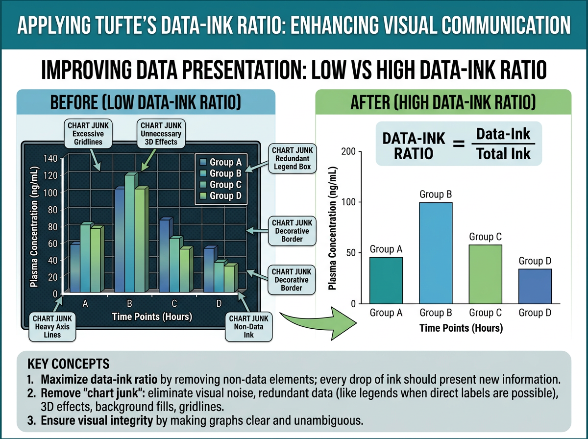
그림 15.1 에서 보듯이, Edward Tufte는 저서 The Visual Display of Quantitative Information (1983)에서 그래프 디자인의 핵심 원칙으로 데이터-잉크 비율(data-ink ratio)을 제시했습니다:
\[\text{Data-ink ratio} = \frac{\text{데이터를 표현하는 잉크}}{\text{그래프에 사용된 총 잉크}}\]
이 비율은 가능한 한 1에 가까워야 합니다. 즉, 그래프의 모든 요소는 데이터를 전달하는 데 기여해야 하며, 장식적 요소(chartjunk)는 최소화해야 합니다.
PK-PD 그래프에서 이 원칙을 적용하면:
- 불필요한 격자선 제거: 주요 격자선만 유지, 보조 격자선은 제거 또는 연하게
- 3D 효과 사용 금지: 2D로 충분히 전달 가능한 정보에 3D를 사용하면 왜곡
- 과도한 색상 사용 자제: 구분이 필요한 경우에만 색상 사용
- 축 범위 최적화: 데이터 범위에 맞게 축을 조절하되, 0을 포함할 필요가 없는 경우 생략 가능
15.1.2 색상 접근성 (Color Accessibility)
전 세계 남성의 약 8%, 여성의 약 0.5%가 색각 이상을 가지고 있습니다. 따라서 과학적 그래프에서는 colorblind-friendly 색상 팔레트를 사용하는 것이 필수적입니다.
# 추천 색상 팔레트

# 1. viridis 팔레트 (연속형, colorblind-friendly)
p1 <- ggplot(mtcars, aes(x = wt, y = mpg, color = disp)) +
  geom_point(size = 3) +
  scale_color_viridis_c(option = "D") +
  labs(title = "viridis (연속형)") +
  theme_bw()

# 2. Okabe-Ito 팔레트 (범주형, 가장 권장되는 팔레트)
okabe_ito <- c("#E69F00", "#56B4E9", "#009E73", "#F0E442",
               "#0072B2", "#D55E00", "#CC79A7", "#999999")

# 3. RColorBrewer (다양한 유형)
# 순차적(sequential): Blues, Reds, YlOrRd
# 발산적(diverging): RdBu, RdYlGn
# 정성적(qualitative): Set1, Set2, Dark2

# 색상 팔레트 비교
display.brewer.all(colorblindFriendly = TRUE)
경고빨강-초록 조합을 피하세요
가장 흔한 색각 이상은 적록색맹(deuteranopia, protanopia)입니다. 따라서 빨강과 초록을 구분 요소로 사용하는 것은 피해야 합니다. 대신 파랑-주황, 파랑-빨강, 보라-노랑 조합을 사용하세요. ggplot2에서 scale_color_brewer(palette = "Set2") 또는 scale_color_viridis_d()를 사용하면 안전합니다.
15.1.3 규제 제출용 그래프 요구사항
FDA, EMA, PMDA 등 규제 기관에 제출하는 PK/PD 보고서의 그래프는 다음 요구사항을 충족해야 합니다:
FDA (미국 식품의약국):
- 해상도: 최소 300 DPI
- 형식: PDF, TIFF, PNG 허용
- 축 레이블: 단위 포함 (예: “Concentration (ng/mL)”)
- 범례(legend): 그래프 내 또는 아래에 명확하게 배치
- 폰트: Arial, Helvetica, Times New Roman (serif/sans-serif)
- 크기: 라벨과 숫자가 인쇄 시 읽을 수 있는 크기 (최소 8pt)
EMA (유럽의약품청):
- 개인 데이터와 모델 예측을 함께 표시하는 것을 선호
- 잔차(residual) 그래프에서 기준선(reference line) 필수
- 색상이 아닌 심볼(shape)로도 구분 가능해야 함 (흑백 인쇄 고려)
PMDA (일본 의약품의료기기종합기구):
- 일본어 라벨 허용 (영어 병기 권장)
- 개인 데이터의 산점도와 평균 프로파일 모두 제출 선호
# 규제 제출용 기본 테마 설정
theme_regulatory <- function(base_size = 11, base_family = "Arial") {
  theme_bw(base_size = base_size, base_family = base_family) %+replace%
    theme(
      # 패널
      panel.grid.minor = element_blank(),
      panel.border = element_rect(color = "black", linewidth = 0.5),
      # 축
      axis.title = element_text(size = base_size, face = "bold"),
      axis.text = element_text(size = base_size - 1, color = "black"),
      axis.ticks = element_line(color = "black", linewidth = 0.3),
      # 범례
      legend.position = "bottom",
      legend.title = element_text(size = base_size - 1, face = "bold"),
      legend.text = element_text(size = base_size - 2),
      legend.key.size = unit(0.8, "lines"),
      # 제목
      plot.title = element_text(size = base_size + 1, face = "bold",
                                 hjust = 0),
      plot.subtitle = element_text(size = base_size - 1, hjust = 0),
      # 여백
      plot.margin = margin(10, 10, 10, 10)
    )
}
15.1.4 출판용 그래프 품질 기준
학술지 투고용 그래프는 다음 기준을 따릅니다:
| 항목 | 권장 사항 |
|---|---|
| 해상도 | 300 DPI (래스터), 벡터 형식 선호 |
| 형식 | TIFF (무손실), PDF/EPS (벡터) |
| 색상 모드 | CMYK (인쇄), RGB (온라인) |
| 폰트 크기 | 본문 8-10pt, 제목 10-12pt |
| 선 굵기 | 0.5-1.0 pt |
| 그래프 크기 | 단일 컬럼 85mm, 이중 컬럼 170mm |
| 데이터 포인트 | 크기 1.5-3pt, 반투명(alpha) 사용 |
15.2 PK/PD 핵심 그래프 유형
15.2.1 농도-시간 그래프 (Concentration-Time Plot)
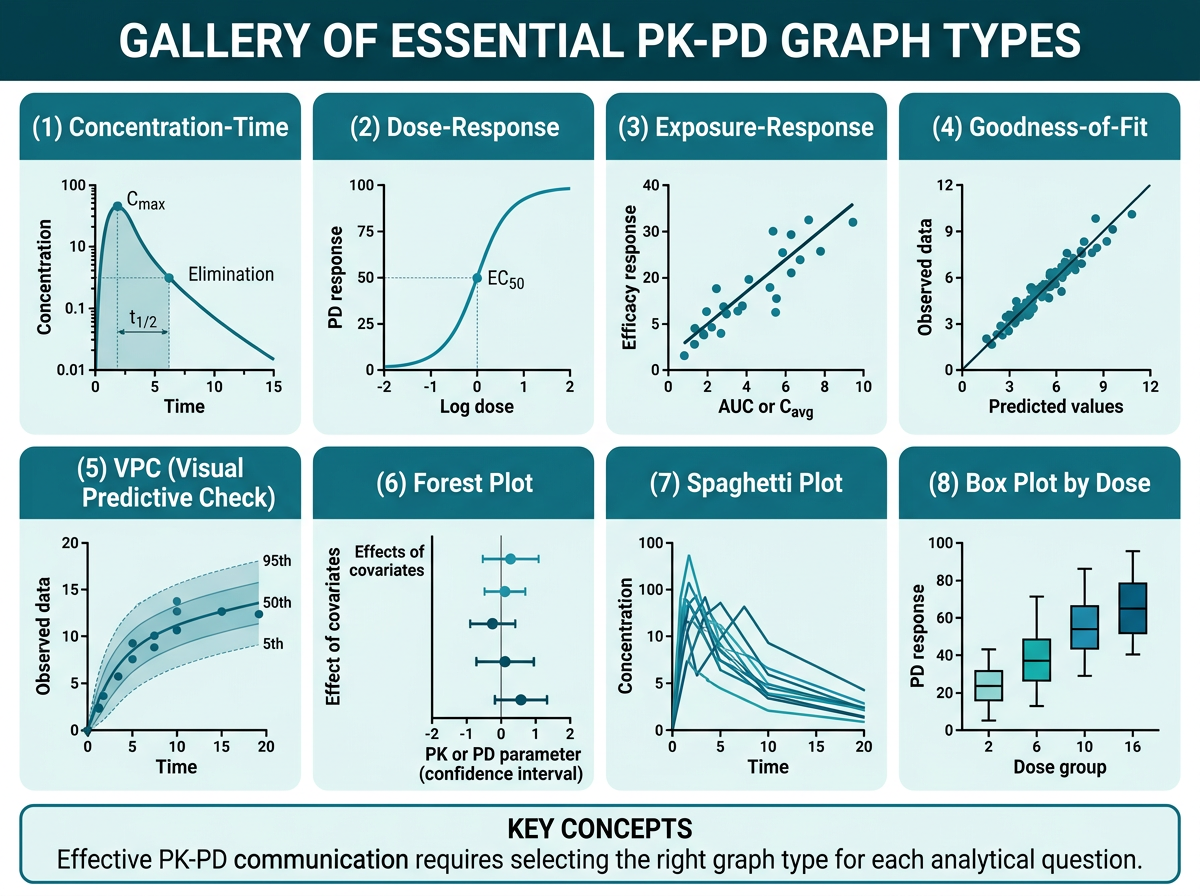
그림 15.2 은 PK-PD 분석에서 자주 사용되는 핵심 그래프 유형을 갤러리 형태로 정리한 것입니다. 농도-시간 그래프는 PK 분석의 가장 기본적이고 중요한 그래프입니다. 선형(linear) 스케일과 반로그(semi-logarithmic) 스케일 두 가지를 반드시 함께 제시해야 합니다.
# 시뮬레이션: 농도-시간 데이터 생성
set.seed(2024)
n_subj <- 30
n_time <- 12
dose_groups <- c(100, 200, 400)  # mg

pk_sim <- expand_grid(
  ID = 1:n_subj,
  TIME = c(0, 0.5, 1, 2, 4, 6, 8, 12, 24, 48, 72, 96)
) |>
  mutate(
    DOSE = rep(rep(dose_groups, each = n_subj / 3), each = n_time),
    DOSE_label = paste0(DOSE, " mg"),
    # 1-구획 모형 시뮬레이션
    CL = rlnorm(n(), log(5), 0.3),
    V = rlnorm(n(), log(50), 0.2),
    ka = rlnorm(n(), log(1.5), 0.3),
    ke = CL / V,
    # 농도 계산 (경구 투여, 1-구획)
    CONC = (DOSE * ka / (V * (ka - ke))) *
           (exp(-ke * TIME) - exp(-ka * TIME)) +
           rnorm(n(), 0, 0.5),
    CONC = pmax(CONC, 0)  # 음수 방지
  )

# 개인 ID별 파라미터 고정 (같은 개인은 같은 PK 파라미터)
pk_sim <- pk_sim |>
  group_by(ID) |>
  mutate(
    CL = first(CL), V = first(V), ka = first(ka), ke = first(ke)
  ) |>
  ungroup() |>
  mutate(
    CONC = (DOSE * first(ka) / (first(V) * (first(ka) - first(ke)))) *
           (exp(-first(ke) * TIME) - exp(-first(ka) * TIME)),
    CONC = pmax(CONC + rnorm(n(), 0, 0.3), 0)
  )

# 더 현실적인 시뮬레이션
pk_sim <- expand_grid(
  ID = 1:n_subj,
  TIME = c(0, 0.5, 1, 2, 4, 6, 8, 12, 24, 48, 72, 96)
) |>
  mutate(DOSE = rep(rep(dose_groups, each = n_subj / 3), each = n_time))

# 개인별 PK 파라미터
pk_params <- tibble(
  ID = 1:n_subj,
  CL_i = rlnorm(n_subj, log(5), 0.3),
  V_i = rlnorm(n_subj, log(50), 0.25),
  ka_i = rlnorm(n_subj, log(1.2), 0.35)
) |>
  mutate(ke_i = CL_i / V_i)

pk_sim <- pk_sim |>
  left_join(pk_params, by = "ID") |>
  mutate(
    CONC = (DOSE * ka_i / (V_i * (ka_i - ke_i))) *
           (exp(-ke_i * TIME) - exp(-ka_i * TIME)),
    CONC = pmax(CONC + rnorm(n(), 0, 0.2), 0),
    DOSE_label = factor(paste0(DOSE, " mg"),
                        levels = c("100 mg", "200 mg", "400 mg"))
  )
# (A) Spaghetti plot (Linear scale) - 개인별 프로파일
p_linear <- ggplot(pk_sim, aes(x = TIME, y = CONC,
group = ID, color = DOSE_label)) +
geom_line(alpha = 0.4, linewidth = 0.5) +
geom_point(alpha = 0.3, size = 1) +
scale_color_brewer(palette = "Set1", name = "용량군") +
labs(
x = "시간 (h)",
y = "혈중 농도 (ng/mL)",
title = "(A) 개인별 농도-시간 프로파일 (Linear)"
) +
theme_bw(base_size = 11) +
theme(legend.position = "bottom")
# (B) Semi-log scale
p_semilog <- ggplot(pk_sim |> filter(CONC > 0),
aes(x = TIME, y = CONC,
group = ID, color = DOSE_label)) +
geom_line(alpha = 0.4, linewidth = 0.5) +
geom_point(alpha = 0.3, size = 1) +
scale_y_log10(
labels = scales::label_number(),
breaks = c(0.1, 1, 10, 100)
) +
scale_color_brewer(palette = "Set1", name = "용량군") +
labs(
x = "시간 (h)",
y = "혈중 농도 (ng/mL)",
title = "(B) 개인별 농도-시간 프로파일 (Semi-log)"
) +
theme_bw(base_size = 11) +
theme(legend.position = "bottom")
# 합성
p_linear + p_semilog +
plot_layout(guides = "collect") &
theme(legend.position = "bottom")# 평균 + SD 프로파일 (용량군별)
pk_summary <- pk_sim |>
group_by(DOSE_label, TIME) |>
summarise(
Mean = mean(CONC, na.rm = TRUE),
SD = sd(CONC, na.rm = TRUE),
n = n(),
SE = SD / sqrt(n),
.groups = "drop"
)
p_mean <- ggplot(pk_summary, aes(x = TIME, y = Mean,
color = DOSE_label,
fill = DOSE_label)) +
geom_ribbon(aes(ymin = pmax(Mean - SD, 0), ymax = Mean + SD),
alpha = 0.15, color = NA) +
geom_line(linewidth = 1) +
geom_point(size = 2.5) +
scale_color_brewer(palette = "Set1", name = "용량군") +
scale_fill_brewer(palette = "Set1", name = "용량군") +
labs(
x = "시간 (h)",
y = "혈중 농도 (ng/mL)",
title = "용량군별 평균 ± SD 농도-시간 프로파일"
) +
theme_bw(base_size = 11) +
theme(legend.position = "bottom")
p_mean
힌트Linear vs Semi-log: 각각의 역할
Linear scale은 Cmax, Tmax를 직관적으로 보여주며, 농도의 절대적 크기를 비교하는 데 적합합니다. Semi-log scale은 소실상(elimination phase)의 기울기(\(-\lambda_z\))를 직선으로 보여주어 반감기 추정, 다구획 동태(bi-exponential decline) 확인, BLQ 근처의 낮은 농도 관찰에 유용합니다. PK 보고서에서는 반드시 두 가지를 모두 제시합니다.
15.2.2 농도-효과 그래프 (Concentration-Effect Plot)
농도-효과 관계는 PD 분석의 핵심입니다. 가장 일반적인 모델은 Emax 모델입니다:
\[E = E_0 + \frac{E_{max} \times C^\gamma}{EC_{50}^\gamma + C^\gamma}\]
여기서 \(E_0\)는 기저 효과, \(E_{max}\)는 최대 효과, \(EC_{50}\)는 최대 효과의 50%를 나타내는 농도, \(\gamma\)는 Hill 계수입니다.
# 농도-효과 데이터 시뮬레이션
set.seed(42)
n_pd <- 200

pd_data <- tibble(
  ID = 1:n_pd,
  Cavg = rlnorm(n_pd, log(50), 0.6),  # 평균 노출
  # Emax 모델 + 잔차
  Emax = 80,
  EC50 = 40,
  gamma = 1.5,
  E0 = 20,
  Effect = E0 + (Emax * Cavg^gamma) / (EC50^gamma + Cavg^gamma) +
           rnorm(n_pd, 0, 8)
) |>
  mutate(
    Effect = pmin(pmax(Effect, 0), 100),  # 0-100% 범위
    EASI_change = -(Effect),  # EASI 개선율 (음수 = 개선)
    EASI75 = ifelse(Effect >= 75, "EASI-75 달성", "미달성")
  )

# 농도-효과 산점도 + Emax 곡선
emax_curve <- tibble(
  Cavg = seq(0.1, 300, length.out = 200),
  Effect_pred = 20 + (80 * Cavg^1.5) / (40^1.5 + Cavg^1.5)
)

p_conc_effect <- ggplot(pd_data, aes(x = Cavg, y = Effect)) +
  geom_point(alpha = 0.4, color = "steelblue", size = 2) +
  geom_line(data = emax_curve, aes(x = Cavg, y = Effect_pred),
            color = "red", linewidth = 1.2) +
  # EC50 표시
  geom_vline(xintercept = 40, linetype = "dashed", color = "gray50") +
  geom_hline(yintercept = 60, linetype = "dashed", color = "gray50") +
  annotate("text", x = 42, y = 55, label = expression(EC[50] == 40),
           hjust = 0, color = "gray30") +
  labs(
    x = "평균 노출 (Cavg, ng/mL)",
    y = "EASI 개선율 (%)",
    title = "노출-반응 관계: Emax 모델",
    subtitle = expression(E == E[0] + frac(E[max] %*% C^gamma,
                           EC[50]^gamma + C^gamma))
  ) +
  scale_x_log10() +
  theme_bw(base_size = 11)

p_conc_effect
15.2.3 Goodness-of-Fit (GOF) Plots
GOF plots는 모델의 적합도를 평가하는 진단 그래프입니다. PopPK 분석의 필수 그래프 세트입니다.
# GOF 데이터 시뮬레이션
set.seed(123)
n_obs <- 500

gof_data <- tibble(
  OBS = rlnorm(n_obs, log(20), 0.5),
  # 모델 예측 (약간의 bias와 noise 추가)
  PRED = OBS * exp(rnorm(n_obs, 0.05, 0.15)),
  IPRED = OBS * exp(rnorm(n_obs, 0, 0.08)),
  TIME = runif(n_obs, 0, 168),
  # 조건부 가중 잔차
  CWRES = rnorm(n_obs, 0, 1.1),
  # IWRES
  IWRES = rnorm(n_obs, 0, 0.9)
)

# (A) OBS vs PRED (집단 예측)
gof1 <- ggplot(gof_data, aes(x = PRED, y = OBS)) +
  geom_point(alpha = 0.3, size = 1, color = "steelblue") +
  geom_abline(intercept = 0, slope = 1, color = "red",
              linewidth = 0.8) +
  geom_smooth(method = "loess", se = FALSE, color = "darkblue",
              linewidth = 0.7, linetype = "dashed") +
  scale_x_log10() + scale_y_log10() +
  labs(x = "Population Predicted (ng/mL)",
       y = "Observed (ng/mL)",
       title = "(A) OBS vs PRED") +
  coord_equal() +
  theme_bw(base_size = 10)

# (B) OBS vs IPRED (개인 예측)
gof2 <- ggplot(gof_data, aes(x = IPRED, y = OBS)) +
  geom_point(alpha = 0.3, size = 1, color = "steelblue") +
  geom_abline(intercept = 0, slope = 1, color = "red",
              linewidth = 0.8) +
  geom_smooth(method = "loess", se = FALSE, color = "darkblue",
              linewidth = 0.7, linetype = "dashed") +
  scale_x_log10() + scale_y_log10() +
  labs(x = "Individual Predicted (ng/mL)",
       y = "Observed (ng/mL)",
       title = "(B) OBS vs IPRED") +
  coord_equal() +
  theme_bw(base_size = 10)

# (C) CWRES vs TIME
gof3 <- ggplot(gof_data, aes(x = TIME, y = CWRES)) +
  geom_point(alpha = 0.3, size = 1, color = "steelblue") +
  geom_hline(yintercept = c(-2, 0, 2), linetype = c("dashed", "solid", "dashed"),
             color = c("gray50", "red", "gray50")) +
  geom_smooth(method = "loess", se = FALSE, color = "darkblue",
              linewidth = 0.7) +
  labs(x = "Time (h)", y = "CWRES",
       title = "(C) CWRES vs Time") +
  ylim(-4, 4) +
  theme_bw(base_size = 10)

# (D) CWRES vs PRED
gof4 <- ggplot(gof_data, aes(x = PRED, y = CWRES)) +
  geom_point(alpha = 0.3, size = 1, color = "steelblue") +
  geom_hline(yintercept = c(-2, 0, 2), linetype = c("dashed", "solid", "dashed"),
             color = c("gray50", "red", "gray50")) +
  geom_smooth(method = "loess", se = FALSE, color = "darkblue",
              linewidth = 0.7) +
  scale_x_log10() +
  labs(x = "Population Predicted (ng/mL)", y = "CWRES",
       title = "(D) CWRES vs PRED") +
  ylim(-4, 4) +
  theme_bw(base_size = 10)

# 4-panel GOF
(gof1 + gof2) / (gof3 + gof4) +
  plot_annotation(
    title = "Goodness-of-Fit Plots",
    theme = theme(plot.title = element_text(face = "bold", size = 13))
  )
노트GOF Plots 해석 가이드
OBS vs PRED/IPRED: 데이터 점들이 단위선(identity line, y=x)에 가까울수록 좋은 적합도를 의미합니다. LOESS 곡선이 단위선에서 크게 벗어나면 구조적 모델의 부적합(misspecification)을 시사합니다. IPRED는 PRED보다 항상 더 좋은 적합도를 보여야 합니다(개인별 파라미터 사용).
CWRES vs TIME/PRED: 잔차가 0 주위에 균일하게 분포해야 합니다. 패턴(시간에 따른 경향, 예측값에 따른 분산 변화)이 관찰되면 모델 개선이 필요합니다. CWRES의 약 95%가 ±2 이내에 있어야 합니다.
15.2.4 Forest Plot
Forest plot은 공변량 효과, 약물 상호작용, 바이오시밀러 비교 등에서 핵심적으로 사용됩니다.
# 약물 상호작용 forest plot (DDI study)
ddi_data <- tibble(
  Interaction = c(
    "Ketoconazole (강력 CYP3A4 억제)",
    "Fluconazole (중등도 CYP3A4 억제)",
    "Rifampicin (강력 CYP3A4 유도)",
    "Methotrexate 병용",
    "Omeprazole (CYP2C19 억제)",
    "고지방식이"
  ),
  GMR = c(2.03, 1.42, 0.21, 1.05, 1.18, 1.12),
  Lower = c(1.78, 1.22, 0.16, 0.92, 1.05, 0.98),
  Upper = c(2.31, 1.65, 0.28, 1.20, 1.33, 1.28)
) |>
  mutate(
    Interaction = fct_rev(fct_inorder(Interaction)),
    Significant = (Lower > 1.25 | Upper < 0.80)
  )

ggplot(ddi_data, aes(x = GMR, y = Interaction)) +
  # 동등성 범위 (80-125%)
  annotate("rect", xmin = 0.80, xmax = 1.25,
           ymin = -Inf, ymax = Inf,
           fill = "#E8F5E9", alpha = 0.5) +
  geom_vline(xintercept = 1, color = "gray40") +
  geom_vline(xintercept = c(0.80, 1.25), linetype = "dashed",
             color = "gray60") +
  geom_errorbarh(aes(xmin = Lower, xmax = Upper,
                      color = Significant),
                 height = 0.25, linewidth = 0.8) +
  geom_point(aes(color = Significant), size = 3) +
  scale_color_manual(values = c("FALSE" = "gray50", "TRUE" = "#D62728"),
                     guide = "none") +
  scale_x_log10(breaks = c(0.125, 0.25, 0.5, 0.8, 1.0, 1.25, 2.0, 4.0),
                labels = c("0.125", "0.25", "0.5", "0.80",
                           "1.0", "1.25", "2.0", "4.0")) +
  labs(
    x = "AUC 기하평균 비 (GMR) [90% CI]",
    y = NULL,
    title = "약물 상호작용 Forest Plot",
    subtitle = "녹색 영역: 동등성 범위 (80-125%)"
  ) +
  theme_bw(base_size = 11) +
  theme(
    panel.grid.major.y = element_blank(),
    axis.text.y = element_text(size = 10)
  )
15.2.5 Waterfall Plot
Waterfall plot은 개인별 치료 반응의 크기를 직관적으로 보여줍니다. 종양학에서 주로 사용되지만, 피부과에서도 PASI/EASI 개선율을 표시하는 데 유용합니다.
# Waterfall plot: 개인별 EASI 변화
set.seed(2024)
n_wf <- 80

waterfall_data <- tibble(
  ID = 1:n_wf,
  EASI_change = c(
    rnorm(n_wf * 0.7, -65, 20),  # 반응군
    rnorm(n_wf * 0.2, -20, 15),  # 부분 반응군
    rnorm(n_wf * 0.1, 10, 10)    # 비반응군
  )[1:n_wf]
) |>
  mutate(
    EASI_change = pmin(pmax(EASI_change, -100), 50),
    Response = case_when(
      EASI_change <= -75 ~ "EASI-75",
      EASI_change <= -50 ~ "EASI-50",
      EASI_change <= 0 ~ "개선",
      TRUE ~ "악화"
    ),
    Response = factor(Response,
                      levels = c("EASI-75", "EASI-50", "개선", "악화"))
  ) |>
  arrange(EASI_change) |>
  mutate(rank = row_number())

ggplot(waterfall_data, aes(x = rank, y = EASI_change, fill = Response)) +
  geom_col(width = 0.8) +
  # 기준선
  geom_hline(yintercept = 0, color = "black", linewidth = 0.5) +
  geom_hline(yintercept = -75, linetype = "dashed",
             color = "darkgreen", linewidth = 0.5) +
  geom_hline(yintercept = -50, linetype = "dashed",
             color = "orange", linewidth = 0.5) +
  # 주석
  annotate("text", x = n_wf * 0.95, y = -73,
           label = "EASI-75", color = "darkgreen",
           hjust = 1, fontface = "bold", size = 3.5) +
  annotate("text", x = n_wf * 0.95, y = -48,
           label = "EASI-50", color = "orange",
           hjust = 1, fontface = "bold", size = 3.5) +
  scale_fill_manual(
    values = c("EASI-75" = "#2CA02C", "EASI-50" = "#FF7F0E",
               "개선" = "#1F77B4", "악화" = "#D62728"),
    name = "반응 분류"
  ) +
  labs(
    x = "환자 (반응 크기순 정렬)",
    y = "EASI 변화율 (%)",
    title = "Waterfall Plot: 개인별 EASI 변화"
  ) +
  scale_y_continuous(breaks = seq(-100, 50, 25)) +
  theme_bw(base_size = 11) +
  theme(
    axis.text.x = element_blank(),
    axis.ticks.x = element_blank(),
    legend.position = "bottom"
  )
15.2.6 Kaplan-Meier Plot
시간-사건(time-to-event) 분석에서 사용되는 생존 곡선입니다. PK-PD 맥락에서는 “PASI-75 도달까지의 시간” 등을 분석하는 데 활용됩니다.
# Kaplan-Meier 데이터 시뮬레이션
set.seed(42)
n_km <- 150

km_data <- tibble(
  ID = 1:n_km,
  Group = rep(c("위약", "저용량", "고용량"), each = n_km / 3),
  # PASI-75 도달 시간 (주)
  Time = case_when(
    Group == "위약" ~ rexp(n_km / 3, rate = 0.02),
    Group == "저용량" ~ rexp(n_km / 3, rate = 0.06),
    Group == "고용량" ~ rexp(n_km / 3, rate = 0.12)
  ),
  # 중도절단 (24주 연구)
  Event = ifelse(Time <= 24, 1, 0),
  Time = pmin(Time, 24)
) |>
  mutate(Group = factor(Group, levels = c("위약", "저용량", "고용량")))

# KM 곡선 (survfit 사용)
# library(survival)
# library(survminer)
# fit <- survfit(Surv(Time, Event) ~ Group, data = km_data)
# ggsurvplot(fit, data = km_data, ...)

# ggplot2로 직접 구현 (간단한 버전)
km_calc <- km_data |>
  group_by(Group) |>
  arrange(Time) |>
  mutate(
    n_risk = n() - row_number() + 1,
    cum_event = cumsum(Event),
    surv = 1 - cum_event / n()
  ) |>
  # PASI-75 미달성 확률 → "달성 확률"로 변환
  mutate(achieve_prob = 1 - surv)

ggplot(km_calc, aes(x = Time, y = achieve_prob,
                     color = Group)) +
  geom_step(linewidth = 1) +
  scale_color_brewer(palette = "Set1", name = "투여군") +
  labs(
    x = "시간 (주)",
    y = "PASI-75 달성 확률",
    title = "PASI-75 도달 시간 분석 (Kaplan-Meier)"
  ) +
  scale_y_continuous(labels = scales::percent,
                     limits = c(0, 1)) +
  theme_bw(base_size = 11) +
  theme(legend.position = "bottom")
15.2.7 Tornado Plot (민감도 분석)
Tornado plot은 각 공변량 또는 파라미터가 결과에 미치는 상대적 영향을 비교하는 데 사용됩니다.
# Tornado plot: 파라미터 민감도 분석
tornado_data <- tibble(
  Parameter = c("CL", "V", "ka", "Emax", "EC50",
                "체중", "eGFR", "ADA 상태"),
  Low = c(-25, -8, -5, -30, 20, -15, -12, 0),
  High = c(30, 10, 7, 35, -18, 18, 15, 40)
) |>
  mutate(
    Range = abs(High - Low),
    Parameter = fct_reorder(Parameter, Range)
  )

ggplot(tornado_data) +
  geom_col(aes(x = Low, y = Parameter), fill = "#2166AC",
           alpha = 0.8, width = 0.6) +
  geom_col(aes(x = High, y = Parameter), fill = "#B2182B",
           alpha = 0.8, width = 0.6) +
  geom_vline(xintercept = 0, color = "black", linewidth = 0.5) +
  labs(
    x = "Ctrough 변화 (%)",
    y = NULL,
    title = "Tornado Plot: 파라미터 민감도 분석",
    subtitle = "파란색: 하한(-25%), 빨간색: 상한(+25%) 변동"
  ) +
  scale_x_continuous(labels = function(x) paste0(ifelse(x > 0, "+", ""), x, "%")) +
  theme_bw(base_size = 11) +
  theme(panel.grid.major.y = element_blank())
15.2.8 Heatmap
Heatmap은 용량-반응 매트릭스, 공변량 상관관계, 시간-용량별 반응률 등을 시각화하는 데 효과적입니다.
# 용량-시간별 반응률 heatmap
dose_response_matrix <- expand_grid(
  Dose = c("위약", "100 mg", "200 mg", "400 mg"),
  Week = c(4, 8, 12, 16, 24)
) |>
  mutate(
    Dose = factor(Dose, levels = c("위약", "100 mg", "200 mg", "400 mg")),
    # PASI-75 달성률 (시뮬레이션)
    Response_rate = case_when(
      Dose == "위약" ~ pmin(5 + Week * 0.5, 15),
      Dose == "100 mg" ~ pmin(10 + Week * 2, 55),
      Dose == "200 mg" ~ pmin(15 + Week * 3, 75),
      Dose == "400 mg" ~ pmin(20 + Week * 3.5, 85)
    ) + rnorm(n(), 0, 3),
    Response_rate = pmin(pmax(Response_rate, 0), 100)
  )

ggplot(dose_response_matrix, aes(x = factor(Week), y = Dose,
                                   fill = Response_rate)) +
  geom_tile(color = "white", linewidth = 0.5) +
  geom_text(aes(label = paste0(round(Response_rate, 0), "%")),
            color = "white", fontface = "bold", size = 4) +
  scale_fill_viridis_c(option = "C", name = "PASI-75\n달성률 (%)",
                       limits = c(0, 100)) +
  labs(
    x = "치료 주차",
    y = "용량군",
    title = "용량-시간별 PASI-75 달성률"
  ) +
  theme_minimal(base_size = 11) +
  theme(
    panel.grid = element_blank(),
    axis.text = element_text(color = "black")
  )
15.3 ggplot2 심화 테크닉
15.3.1 커스텀 테마 작성: theme_pkpd()
반복적으로 사용하는 그래프 스타일을 함수로 정의하면 코드의 일관성과 효율성을 높일 수 있습니다.
# PK-PD 분석용 커스텀 테마
theme_pkpd <- function(base_size = 11,
                        base_family = "",
                        legend_position = "bottom",
                        grid = "major") {
  t <- theme_bw(base_size = base_size, base_family = base_family) %+replace%
    theme(
      # 패널
      panel.border = element_rect(color = "black", fill = NA,
                                   linewidth = 0.6),
      panel.grid.major = element_line(color = "gray90",
                                       linewidth = 0.3),
      panel.grid.minor = element_blank(),
      # 축
      axis.title = element_text(size = base_size, face = "bold",
                                 color = "black"),
      axis.text = element_text(size = base_size - 1, color = "black"),
      axis.ticks = element_line(color = "black", linewidth = 0.3),
      axis.ticks.length = unit(0.15, "cm"),
      # 범례
      legend.position = legend_position,
      legend.title = element_text(size = base_size - 1, face = "bold"),
      legend.text = element_text(size = base_size - 2),
      legend.background = element_rect(fill = "white", color = NA),
      legend.key = element_rect(fill = "white", color = NA),
      # 제목
      plot.title = element_text(size = base_size + 2, face = "bold",
                                 hjust = 0, margin = margin(b = 5)),
      plot.subtitle = element_text(size = base_size, hjust = 0,
                                    color = "gray30",
                                    margin = margin(b = 10)),
      plot.caption = element_text(size = base_size - 2,
                                   color = "gray50", hjust = 1),
      # Strip (facet 라벨)
      strip.background = element_rect(fill = "gray95", color = "black",
                                       linewidth = 0.4),
      strip.text = element_text(size = base_size - 1, face = "bold")
    )

  if (grid == "none") {
    t <- t + theme(panel.grid.major = element_blank())
  } else if (grid == "y") {
    t <- t + theme(panel.grid.major.x = element_blank())
  } else if (grid == "x") {
    t <- t + theme(panel.grid.major.y = element_blank())
  }

  return(t)
}

# 사용 예시
ggplot(pk_sim, aes(x = TIME, y = CONC, color = DOSE_label)) +
  geom_point(alpha = 0.3) +
  labs(x = "Time (h)", y = "Concentration (ng/mL)") +
  theme_pkpd(base_size = 12, legend_position = "right")
15.3.2 이중 축 (Secondary Axis): PK + PD 동시 표시
이중 축 그래프는 PK 농도와 PD 반응을 동시에 보여줄 때 유용하지만, 해석의 오류를 유발할 수 있으므로 신중하게 사용해야 합니다.
# PK + PD 이중 축 그래프
pk_pd_time <- tibble(
  Week = 0:24,
  # PK: Ctrough (ng/mL)
  Ctrough = c(0, 80, 95, 100, 102, 103, 104, 104, 105, 105,
              105, 105, 105, 105, 105, 105, 105, 105, 105, 105,
              105, 105, 105, 105, 105),
  # PD: EASI score
  EASI = c(30, 25, 20, 16, 13, 11, 9, 8, 7.5, 7,
           6.5, 6.2, 6, 5.8, 5.6, 5.5, 5.4, 5.3, 5.2, 5.1,
           5.0, 5.0, 4.9, 4.9, 4.8)
)

# 스케일링 팩터 (PK와 PD의 축 범위를 맞추기 위해)
scale_factor <- max(pk_pd_time$Ctrough) / max(pk_pd_time$EASI)

ggplot(pk_pd_time, aes(x = Week)) +
  # PK (왼쪽 축)
  geom_line(aes(y = Ctrough, color = "Ctrough"),
            linewidth = 1.2) +
  geom_point(aes(y = Ctrough, color = "Ctrough"), size = 2) +
  # PD (오른쪽 축, 스케일링 적용)
  geom_line(aes(y = EASI * scale_factor, color = "EASI"),
            linewidth = 1.2) +
  geom_point(aes(y = EASI * scale_factor, color = "EASI"), size = 2) +
  # 이중 축 설정
  scale_y_continuous(
    name = "Ctrough (ng/mL)",
    sec.axis = sec_axis(~ . / scale_factor, name = "EASI Score")
  ) +
  scale_color_manual(
    values = c("Ctrough" = "#1F77B4", "EASI" = "#D62728"),
    name = NULL
  ) +
  labs(x = "치료 주차", title = "PK-PD 시간 경과") +
  theme_pkpd() +
  theme(
    axis.title.y.left = element_text(color = "#1F77B4"),
    axis.title.y.right = element_text(color = "#D62728")
  )
경고이중 축 그래프의 주의사항
이중 축(dual-axis) 그래프는 두 변수의 시간적 관계를 한 눈에 보여주는 장점이 있지만, 다음과 같은 위험이 있습니다:
- 스케일링 조작: 축 범위를 조절하여 거짓 상관관계를 만들 수 있음
- 인과관계 오해: 두 추세가 함께 보인다고 인과관계가 있는 것은 아님
- 해석 혼란: 어느 축을 봐야 할지 혼란 유발
대안으로 facet을 이용한 분리 표시가 더 정직한 시각화입니다. FDA에서도 이중 축보다 분리된 패널을 선호하는 경향이 있습니다.
15.3.3 다중 패널 (Facet)
# facet_wrap: 개인별 PK 프로파일
# 처음 12명만 표시
pk_individual <- pk_sim |>
  filter(ID %in% 1:12)

ggplot(pk_individual, aes(x = TIME, y = CONC)) +
  geom_line(color = "steelblue", linewidth = 0.7) +
  geom_point(color = "steelblue", size = 1.5) +
  facet_wrap(~ ID, ncol = 4, scales = "free_y",
             labeller = labeller(ID = function(x) paste("ID:", x))) +
  labs(
    x = "시간 (h)",
    y = "농도 (ng/mL)",
    title = "개인별 농도-시간 프로파일"
  ) +
  theme_pkpd(base_size = 9)

# facet_grid: 용량 × 성별
pk_sim_with_sex <- pk_sim |>
  mutate(SEX = rep(c("남성", "여성"), length.out = n()))

ggplot(pk_sim_with_sex, aes(x = TIME, y = CONC,
                              group = ID, color = DOSE_label)) +
  geom_line(alpha = 0.3) +
  facet_grid(SEX ~ DOSE_label) +
  labs(x = "시간 (h)", y = "농도 (ng/mL)") +
  theme_pkpd(base_size = 9) +
  theme(legend.position = "none")
15.3.4 주석 (Annotation): 치료역 표시, EC50 표시
# 치료역(therapeutic window) 표시
mean_profile <- pk_summary |> filter(DOSE_label == "200 mg")

ggplot(mean_profile, aes(x = TIME, y = Mean)) +
  # 치료역 표시
  annotate("rect", xmin = -Inf, xmax = Inf,
           ymin = 5, ymax = 50,
           fill = "#C8E6C9", alpha = 0.4) +
  annotate("text", x = 90, y = 48,
           label = "치료 범위 (Therapeutic Window)",
           color = "darkgreen", fontface = "bold", size = 3.5, hjust = 1) +
  # MEC 표시
  geom_hline(yintercept = 5, linetype = "dashed",
             color = "orange", linewidth = 0.6) +
  annotate("text", x = 90, y = 6,
           label = "MEC (5 ng/mL)",
           color = "orange", hjust = 1, size = 3) +
  # MTC 표시
  geom_hline(yintercept = 50, linetype = "dashed",
             color = "red", linewidth = 0.6) +
  annotate("text", x = 90, y = 52,
           label = "MTC (50 ng/mL)",
           color = "red", hjust = 1, size = 3) +
  # 데이터
  geom_ribbon(aes(ymin = pmax(Mean - SD, 0), ymax = Mean + SD),
              fill = "steelblue", alpha = 0.2) +
  geom_line(color = "steelblue", linewidth = 1.2) +
  geom_point(color = "steelblue", size = 2.5) +
  labs(
    x = "시간 (h)",
    y = "혈중 농도 (ng/mL)",
    title = "치료역과 평균 농도 프로파일 (200 mg)"
  ) +
  theme_pkpd()
15.3.5 그래프 합성: patchwork 패키지
# patchwork 기본 문법
# p1 + p2         : 가로 배치
# p1 / p2         : 세로 배치
# p1 + p2 + p3    : 3개 가로
# (p1 + p2) / p3  : 위 2개, 아래 1개
# p1 | (p2 / p3)  : 왼쪽 1개, 오른쪽 위아래 2개

# 예시: 다양한 레이아웃
layout1 <- (p_linear + p_semilog) /
           p_mean +
  plot_layout(heights = c(1, 1)) +
  plot_annotation(
    title = "PK 프로파일 종합",
    subtitle = "Dose-escalation Study",
    tag_levels = "A",  # (A), (B), (C) 자동 태그
    theme = theme(plot.title = element_text(face = "bold", size = 14))
  )

layout1
# patchwork 고급: 인셋(inset) 그래프
# 큰 그래프 안에 작은 그래프 삽입
main_plot <- ggplot(pk_sim, aes(x = TIME, y = CONC,
group = ID, color = DOSE_label)) +
geom_line(alpha = 0.3) +
labs(x = "시간 (h)", y = "농도 (ng/mL)") +
theme_pkpd()
# 0-4시간 확대 (흡수상)
inset_plot <- ggplot(pk_sim |> filter(TIME <= 4),
aes(x = TIME, y = CONC,
group = ID, color = DOSE_label)) +
geom_line(alpha = 0.4) +
labs(x = "시간 (h)", y = "농도") +
theme_pkpd(base_size = 8) +
theme(legend.position = "none",
plot.background = element_rect(fill = "white", color = "gray50"))
# 인셋 삽입
main_plot + inset_element(inset_plot, left = 0.55, bottom = 0.5,
right = 0.98, top = 0.98)15.3.6 인터랙티브 그래프: plotly 변환
# ggplot2 → plotly 변환
p_interactive <- ggplot(pk_sim, aes(x = TIME, y = CONC,
                                     group = ID, color = DOSE_label,
                                     text = paste0("ID: ", ID,
                                                   "\nTime: ", TIME, " h",
                                                   "\nConc: ",
                                                   round(CONC, 2),
                                                   " ng/mL"))) +
  geom_line(alpha = 0.4) +
  geom_point(alpha = 0.3, size = 1) +
  labs(x = "시간 (h)", y = "농도 (ng/mL)",
       color = "용량군") +
  theme_pkpd()

# plotly로 변환 (hover 정보 포함)
ggplotly(p_interactive, tooltip = "text")
15.4 출판 및 제출 품질
15.4.1 해상도(DPI) 설정
# 용도별 해상도 설정
# 1. 출판용: 300 DPI (래스터)
ggsave("figure_publication.tiff",
       plot = p_mean,
       width = 170, height = 120,   # mm
       units = "mm",
       dpi = 300,
       compression = "lzw")          # TIFF 압축

# 2. 웹/프레젠테이션용: 150 DPI
ggsave("figure_web.png",
       plot = p_mean,
       width = 8, height = 6,       # inches
       units = "in",
       dpi = 150)

# 3. 스크리닝/탐색용: 96 DPI
ggsave("figure_screen.png",
       plot = p_mean,
       width = 8, height = 6,
       dpi = 96)
15.4.2 벡터 형식 출력: SVG, PDF
# PDF 출력 (벡터 형식, 확대해도 깨지지 않음)
ggsave("figure_vector.pdf",
       plot = p_mean,
       width = 170, height = 120,
       units = "mm",
       device = cairo_pdf)  # cairo_pdf: 한글 지원

# SVG 출력 (웹용 벡터)
ggsave("figure_vector.svg",
       plot = p_mean,
       width = 170, height = 120,
       units = "mm")
15.4.3 폰트 설정: showtext/ragg 패키지
한글 폰트를 그래프에 적용하려면 showtext 또는 ragg 패키지가 필요합니다.
# showtext 패키지로 한글 폰트 설정
library(showtext)

# Google Fonts에서 Noto Sans KR 추가
font_add_google("Noto Sans KR", "notosanskr")
showtext_auto()

# 한글 폰트 적용 그래프
ggplot(pk_summary |> filter(DOSE_label == "200 mg"),
       aes(x = TIME, y = Mean)) +
  geom_line(linewidth = 1, color = "steelblue") +
  geom_point(size = 2.5, color = "steelblue") +
  labs(
    x = "시간 (시간)",
    y = "평균 혈중 농도 (ng/mL)",
    title = "200 mg 투여군 평균 농도-시간 프로파일",
    caption = "평균 ± 표준편차, N=10"
  ) +
  theme_pkpd(base_family = "notosanskr")
# ragg 패키지: 고품질 그래픽 디바이스
library(ragg)
# ragg으로 PNG 출력 (시스템 폰트 자동 인식)
agg_png("figure_ragg.png",
width = 170, height = 120, units = "mm",
res = 300)
print(p_mean)
dev.off()
# ggsave에서 ragg 사용
ggsave("figure_ragg2.png",
plot = p_mean,
width = 170, height = 120, units = "mm",
dpi = 300,
device = agg_png)15.4.4 ggsave() 옵션 상세
# ggsave() 전체 옵션 예시
ggsave(
  filename = "pk_profile_final.pdf",
  plot = p_mean,                      # 저장할 그래프 (생략 시 마지막 그래프)
  device = cairo_pdf,                 # 디바이스 (cairo_pdf: 한글 지원)
  path = "figures/",                  # 저장 경로
  width = 170,                        # 너비
  height = 120,                       # 높이
  units = "mm",                       # 단위 ("in", "cm", "mm", "px")
  dpi = 300,                          # 해상도 (래스터 전용)
  scale = 1,                          # 전체 크기 배율
  limitsize = TRUE,                   # 크기 제한 (TRUE: 50x50인치 이하)
  bg = "white"                        # 배경색
)

# 다중 형식 동시 저장 함수
save_plot <- function(plot, name, path = "figures/",
                       width = 170, height = 120) {
  # PDF (벡터)
  ggsave(paste0(path, name, ".pdf"), plot,
         width = width, height = height, units = "mm",
         device = cairo_pdf)
  # PNG (래스터, 300 DPI)
  ggsave(paste0(path, name, ".png"), plot,
         width = width, height = height, units = "mm",
         dpi = 300)
  # TIFF (출판용)
  ggsave(paste0(path, name, ".tiff"), plot,
         width = width, height = height, units = "mm",
         dpi = 300, compression = "lzw")

  message(paste0("저장 완료: ", name, " (.pdf, .png, .tiff)"))
}

# 사용 예시
save_plot(p_mean, "pk_mean_profile")
15.5 종합 실습: PK-PD 보고서 그래프 세트
피부과 PK-PD 보고서에 필요한 전체 그래프 세트를 생성합니다. Adalimumab 건선 임상시험을 가정한 시뮬레이션 데이터를 사용합니다.
15.5.1 데이터 준비
# 종합 실습 데이터 생성
set.seed(2024)
n_patients <- 60
visits <- c(0, 2, 4, 8, 12, 16, 24)  # 주차
dose_groups_bio <- c("위약", "40 mg Q2W", "80 mg Q2W")

# 환자 기본 정보
patients <- tibble(
  ID = 1:n_patients,
  GROUP = rep(dose_groups_bio, each = n_patients / 3),
  WT = round(rlnorm(n_patients, log(75), 0.25), 1),
  AGE = round(pmin(pmax(rnorm(n_patients, 45, 13), 20), 75)),
  SEX = sample(c("M", "F"), n_patients, replace = TRUE),
  BPASI = round(rlnorm(n_patients, log(18), 0.4), 1),
  ADA = sample(c("Neg", "Pos"), n_patients,
               replace = TRUE, prob = c(0.75, 0.25))
)

# 시간별 PK-PD 데이터
full_data <- expand_grid(
  ID = 1:n_patients,
  WEEK = visits
) |>
  left_join(patients, by = "ID") |>
  mutate(
    DOSE_mg = case_when(
      GROUP == "위약" ~ 0,
      GROUP == "40 mg Q2W" ~ 40,
      GROUP == "80 mg Q2W" ~ 80
    ),
    # Ctrough 시뮬레이션 (항체 약물)
    CL_i = 0.35 * (WT / 70)^0.75 *
           ifelse(ADA == "Pos", 1.5, 1.0) *
           exp(rnorm(n(), 0, 0.15)),
    Ctrough = ifelse(DOSE_mg == 0, 0,
                     DOSE_mg * 10 / CL_i *
                     (1 - exp(-0.05 * WEEK)) +
                     rnorm(n(), 0, 2)),
    Ctrough = pmax(Ctrough, 0),
    # EASI score 시뮬레이션
    EASI = case_when(
      DOSE_mg == 0 ~ BPASI * (1 - 0.05 * sqrt(WEEK)) + rnorm(n(), 0, 2),
      DOSE_mg == 40 ~ BPASI * exp(-0.08 * WEEK) + rnorm(n(), 0, 1.5),
      DOSE_mg == 80 ~ BPASI * exp(-0.12 * WEEK) + rnorm(n(), 0, 1.2)
    ),
    EASI = pmax(EASI, 0),
    EASI_change_pct = (EASI - BPASI) / BPASI * 100,
    EASI75 = EASI_change_pct <= -75,
    GROUP = factor(GROUP, levels = dose_groups_bio)
  )
15.5.2 1. Individual PK Profiles (Spaghetti + Mean)
# 개인별 Ctrough + 평균
ctrough_summary <- full_data |>
  filter(DOSE_mg > 0) |>
  group_by(GROUP, WEEK) |>
  summarise(
    Mean = mean(Ctrough, na.rm = TRUE),
    SD = sd(Ctrough, na.rm = TRUE),
    .groups = "drop"
  )

fig1 <- ggplot() +
  # 개인 프로파일
  geom_line(data = full_data |> filter(DOSE_mg > 0),
            aes(x = WEEK, y = Ctrough, group = ID, color = GROUP),
            alpha = 0.25, linewidth = 0.4) +
  # 평균 프로파일
  geom_line(data = ctrough_summary,
            aes(x = WEEK, y = Mean, color = GROUP),
            linewidth = 1.5) +
  geom_point(data = ctrough_summary,
             aes(x = WEEK, y = Mean, color = GROUP),
             size = 3) +
  scale_color_manual(values = c("40 mg Q2W" = "#1F77B4",
                                 "80 mg Q2W" = "#D62728"),
                     name = "투여군") +
  labs(
    x = "치료 주차",
    y = "Ctrough (mg/L)",
    title = "Fig 1. 개인별 및 평균 Ctrough 프로파일"
  ) +
  theme_pkpd()

fig1
15.5.3 2. Dose-Normalized Concentration Plot
fig2 <- full_data |>
  filter(DOSE_mg > 0) |>
  mutate(
    CONC_DN = Ctrough / DOSE_mg,
    GROUP = GROUP
  ) |>
  ggplot(aes(x = WEEK, y = CONC_DN, color = GROUP)) +
  geom_jitter(alpha = 0.3, width = 0.3, size = 1) +
  stat_summary(fun = mean, geom = "line", linewidth = 1.2) +
  stat_summary(fun = mean, geom = "point", size = 3) +
  scale_color_manual(values = c("40 mg Q2W" = "#1F77B4",
                                 "80 mg Q2W" = "#D62728"),
                     name = "투여군") +
  labs(
    x = "치료 주차",
    y = "Dose-normalized Ctrough (mg/L per mg)",
    title = "Fig 2. 용량 보정 Ctrough"
  ) +
  theme_pkpd()

fig2
15.5.4 3. PK Parameter Summary (Boxplot + Jitter)
# Week 24 Ctrough 요약
pk_w24 <- full_data |>
  filter(WEEK == 24, DOSE_mg > 0)

fig3 <- ggplot(pk_w24, aes(x = GROUP, y = Ctrough, fill = GROUP)) +
  geom_boxplot(alpha = 0.6, outlier.shape = NA, width = 0.5) +
  geom_jitter(width = 0.15, alpha = 0.5, size = 2, shape = 21,
              color = "black", stroke = 0.3) +
  stat_summary(fun = mean, geom = "point", shape = 23,
               size = 4, fill = "yellow", color = "black") +
  scale_fill_manual(values = c("40 mg Q2W" = "#1F77B4",
                                "80 mg Q2W" = "#D62728"),
                    guide = "none") +
  labs(
    x = "투여군",
    y = "Ctrough at Week 24 (mg/L)",
    title = "Fig 3. Week 24 Ctrough 분포",
    caption = "◇ = 평균"
  ) +
  theme_pkpd()

fig3
15.5.5 4. Concentration-Effect Relationship (EASI Score)
fig4 <- full_data |>
  filter(WEEK == 24) |>
  ggplot(aes(x = Ctrough, y = EASI_change_pct)) +
  geom_point(aes(color = GROUP), alpha = 0.6, size = 2.5) +
  geom_smooth(method = "loess", se = TRUE,
              color = "black", linewidth = 1, fill = "gray80") +
  geom_hline(yintercept = -75, linetype = "dashed",
             color = "darkgreen") +
  annotate("text", x = max(full_data$Ctrough, na.rm = TRUE) * 0.9,
           y = -73, label = "EASI-75", color = "darkgreen",
           fontface = "bold", hjust = 1) +
  scale_color_manual(values = c("위약" = "gray50",
                                 "40 mg Q2W" = "#1F77B4",
                                 "80 mg Q2W" = "#D62728"),
                     name = "투여군") +
  labs(
    x = "Week 24 Ctrough (mg/L)",
    y = "EASI 변화율 (%)",
    title = "Fig 4. 노출-반응 관계 (Week 24)"
  ) +
  theme_pkpd()

fig4
15.5.6 5. Exposure-Response: P(EASI-75) vs Ctrough
# Ctrough 사분위수별 EASI-75 달성률
fig5_data <- full_data |>
  filter(WEEK == 24, DOSE_mg > 0) |>
  mutate(
    Ctrough_Q = cut(Ctrough,
                    breaks = quantile(Ctrough, probs = c(0, 0.25, 0.5, 0.75, 1),
                                      na.rm = TRUE),
                    labels = c("Q1\n(최저)", "Q2", "Q3", "Q4\n(최고)"),
                    include.lowest = TRUE)
  ) |>
  group_by(Ctrough_Q) |>
  summarise(
    n = n(),
    n_resp = sum(EASI75, na.rm = TRUE),
    rate = n_resp / n * 100,
    se = sqrt(rate * (100 - rate) / n),
    lower = pmax(rate - 1.96 * se, 0),
    upper = pmin(rate + 1.96 * se, 100),
    .groups = "drop"
  )

fig5 <- ggplot(fig5_data, aes(x = Ctrough_Q, y = rate)) +
  geom_col(fill = "#1F77B4", alpha = 0.7, width = 0.6) +
  geom_errorbar(aes(ymin = lower, ymax = upper),
                width = 0.2, linewidth = 0.6) +
  geom_text(aes(label = paste0(round(rate, 0), "%\n(", n_resp, "/", n, ")")),
            vjust = -0.5, size = 3.5) +
  labs(
    x = "Ctrough 사분위수",
    y = "EASI-75 달성률 (%)",
    title = "Fig 5. 노출-반응: Ctrough 사분위수별 EASI-75"
  ) +
  scale_y_continuous(limits = c(0, 110)) +
  theme_pkpd(grid = "y")

fig5
15.5.7 6. Covariate Effect Forest Plot
cov_effects <- tibble(
  Covariate = c(
    "체중 90kg vs 70kg", "체중 50kg vs 70kg",
    "ADA+ vs ADA-", "남성 vs 여성",
    "나이 65세 vs 45세", "BPASI 30 vs 15"
  ),
  Effect = c(22, -25, 48, 5, -8, 3),
  Lower = c(14, -33, 35, -3, -16, -5),
  Upper = c(30, -17, 62, 13, 0, 11)
) |>
  mutate(Covariate = fct_rev(fct_inorder(Covariate)))

fig6 <- ggplot(cov_effects, aes(x = Effect, y = Covariate)) +
  annotate("rect", xmin = -20, xmax = 20,
           ymin = -Inf, ymax = Inf,
           fill = "#E8F5E9", alpha = 0.5) +
  geom_vline(xintercept = 0, color = "gray40") +
  geom_vline(xintercept = c(-20, 20), linetype = "dashed",
             color = "gray60") +
  geom_errorbarh(aes(xmin = Lower, xmax = Upper),
                 height = 0.25, linewidth = 0.8, color = "#D62728") +
  geom_point(size = 3, color = "#D62728") +
  scale_x_continuous(
    labels = function(x) paste0(ifelse(x > 0, "+", ""), x, "%")
  ) +
  labs(
    x = "CL의 상대적 변화 (%)",
    y = NULL,
    title = "Fig 6. 공변량 효과 Forest Plot"
  ) +
  theme_pkpd(grid = "x")

fig6
15.5.8 7. Time-Course PD Response (EASI by Visit)
easi_summary <- full_data |>
  group_by(GROUP, WEEK) |>
  summarise(
    Mean_EASI = mean(EASI, na.rm = TRUE),
    SE = sd(EASI, na.rm = TRUE) / sqrt(n()),
    .groups = "drop"
  )

fig7 <- ggplot(easi_summary, aes(x = WEEK, y = Mean_EASI,
                                   color = GROUP, fill = GROUP)) +
  geom_ribbon(aes(ymin = Mean_EASI - SE, ymax = Mean_EASI + SE),
              alpha = 0.15, color = NA) +
  geom_line(linewidth = 1.2) +
  geom_point(size = 3) +
  scale_color_manual(values = c("위약" = "gray50",
                                 "40 mg Q2W" = "#1F77B4",
                                 "80 mg Q2W" = "#D62728"),
                     name = "투여군") +
  scale_fill_manual(values = c("위약" = "gray50",
                                "40 mg Q2W" = "#1F77B4",
                                "80 mg Q2W" = "#D62728"),
                    name = "투여군") +
  labs(
    x = "치료 주차",
    y = "평균 EASI Score",
    title = "Fig 7. 투여군별 EASI Score 시간 경과",
    caption = "평균 ± SE"
  ) +
  theme_pkpd()

fig7
15.5.9 8. Waterfall Plot (Individual EASI Change)
wf_data <- full_data |>
  filter(WEEK == 24) |>
  mutate(
    Response_cat = case_when(
      EASI_change_pct <= -75 ~ "EASI-75",
      EASI_change_pct <= -50 ~ "EASI-50",
      EASI_change_pct <= 0 ~ "개선",
      TRUE ~ "악화"
    ),
    Response_cat = factor(Response_cat,
                          levels = c("EASI-75", "EASI-50", "개선", "악화"))
  ) |>
  arrange(EASI_change_pct) |>
  mutate(rank = row_number())

fig8 <- ggplot(wf_data, aes(x = rank, y = EASI_change_pct,
                              fill = Response_cat)) +
  geom_col(width = 0.8) +
  geom_hline(yintercept = c(0, -50, -75), linetype = c("solid", "dashed", "dashed"),
             color = c("black", "orange", "darkgreen"),
             linewidth = c(0.5, 0.5, 0.5)) +
  scale_fill_manual(
    values = c("EASI-75" = "#2CA02C", "EASI-50" = "#FF7F0E",
               "개선" = "#1F77B4", "악화" = "#D62728"),
    name = "반응"
  ) +
  labs(
    x = "환자 (반응순 정렬)",
    y = "EASI 변화율 (%)",
    title = "Fig 8. 개인별 EASI 변화 (Week 24)"
  ) +
  theme_pkpd() +
  theme(axis.text.x = element_blank(), axis.ticks.x = element_blank())

fig8
15.5.10 다중 패널 레이아웃 (patchwork)
# 전체 보고서 레이아웃
# 페이지 1: PK 그래프
page1 <- (fig1 + fig2) / (fig3 + fig5) +
  plot_annotation(
    title = "Adalimumab 건선 PK-PD Study: PK Results",
    tag_levels = list(c("Fig 1", "Fig 2", "Fig 3", "Fig 5")),
    theme = theme(
      plot.title = element_text(face = "bold", size = 16),
      plot.tag = element_text(size = 10, face = "bold")
    )
  )

ggsave("report_page1_pk.pdf", page1,
       width = 350, height = 250, units = "mm",
       device = cairo_pdf)

# 페이지 2: PD 그래프
page2 <- (fig4 + fig6) / (fig7 + fig8) +
  plot_annotation(
    title = "Adalimumab 건선 PK-PD Study: PD Results",
    tag_levels = list(c("Fig 4", "Fig 6", "Fig 7", "Fig 8")),
    theme = theme(
      plot.title = element_text(face = "bold", size = 16),
      plot.tag = element_text(size = 10, face = "bold")
    )
  )

ggsave("report_page2_pd.pdf", page2,
       width = 350, height = 250, units = "mm",
       device = cairo_pdf)
15.6 약리학 노트: FDA/EMA 바이오시밀러 그래프 사례
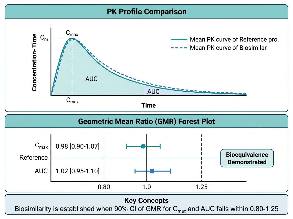
15.6.1 Adalimumab 바이오시밀러 PK 비교
그림 15.3 은 바이오시밀러 PK 동등성 평가의 핵심 시각화를 보여줍니다. Adalimumab(Humira)은 가장 많은 바이오시밀러가 개발된 생물학적 제제입니다. 바이오시밀러 허가 시 PK 동등성 입증을 위해 다음 그래프들이 핵심적으로 제출됩니다.
PK 프로파일 비교 그래프: 참조약(reference)과 바이오시밀러의 평균 농도-시간 프로파일을 겹쳐 표시합니다.
# 바이오시밀러 PK 비교 시뮬레이션
set.seed(42)
n_bio <- 100  # 각 군 50명

biosim_data <- expand_grid(
  ID = 1:n_bio,
  TIME = c(0, 6, 12, 24, 48, 72, 96, 120, 168, 240, 336, 504, 672)
) |>
  mutate(
    Group = rep(c("참조약 (Humira)", "바이오시밀러"),
                each = n_bio / 2 * 13),
    # SC 투여 후 1-구획 모형 (mAb 특성 반영)
    CL_i = rlnorm(n(), log(0.35), 0.25),
    V_i = rlnorm(n(), log(8), 0.2),
    ka_i = rlnorm(n(), log(0.01), 0.3),
    F_i = rlnorm(n(), log(0.64), 0.15),
    ke_i = CL_i / V_i,
    CONC = (40 * F_i * ka_i / (V_i * (ka_i - ke_i))) *
           (exp(-ke_i * TIME) - exp(-ka_i * TIME)),
    CONC = pmax(CONC + rnorm(n(), 0, 0.1), 0)
  )

# 평균 프로파일
biosim_summary <- biosim_data |>
  group_by(Group, TIME) |>
  summarise(
    GM = exp(mean(log(pmax(CONC, 0.001)))),
    GSD_low = exp(mean(log(pmax(CONC, 0.001))) - sd(log(pmax(CONC, 0.001)))),
    GSD_high = exp(mean(log(pmax(CONC, 0.001))) + sd(log(pmax(CONC, 0.001)))),
    .groups = "drop"
  )

ggplot(biosim_summary, aes(x = TIME / 24, y = GM,
                             color = Group, fill = Group)) +
  geom_ribbon(aes(ymin = GSD_low, ymax = GSD_high),
              alpha = 0.15, color = NA) +
  geom_line(linewidth = 1.2) +
  geom_point(size = 2.5) +
  scale_color_manual(values = c("참조약 (Humira)" = "#1F77B4",
                                 "바이오시밀러" = "#D62728"),
                     name = NULL) +
  scale_fill_manual(values = c("참조약 (Humira)" = "#1F77B4",
                                "바이오시밀러" = "#D62728"),
                    name = NULL) +
  labs(
    x = "시간 (일)",
    y = "혈중 농도 (μg/mL)",
    title = "Adalimumab 바이오시밀러 PK 동등성 시험",
    subtitle = "기하평균 ± GSD, 40 mg SC 단회 투여",
    caption = "Source: Simulated data for educational purposes"
  ) +
  theme_pkpd()
15.6.2 PK 동등성 Forest Plot (90% CI, 80-125%)
바이오시밀러의 PK 동등성 판정에서 가장 핵심적인 그래프입니다. AUC와 Cmax의 기하평균 비(Geometric Mean Ratio, GMR)와 90% 신뢰구간이 80-125% 범위 안에 완전히 포함되어야 PK 동등성이 입증됩니다.
# 바이오시밀러 동등성 forest plot
be_data <- tibble(
  Parameter = c(
    expression(AUC[inf]),
    expression(AUC[last]),
    expression(C[max])
  ),
  Parameter_label = c("AUC_inf", "AUC_last", "Cmax"),
  GMR = c(1.02, 1.01, 0.98),
  Lower = c(0.94, 0.93, 0.88),
  Upper = c(1.11, 1.10, 1.09),
  Pass = c(TRUE, TRUE, TRUE)
)

ggplot(be_data, aes(x = GMR, y = fct_rev(Parameter_label))) +
  # 동등성 범위 (80-125%)
  annotate("rect", xmin = 0.80, xmax = 1.25,
           ymin = -Inf, ymax = Inf,
           fill = "#C8E6C9", alpha = 0.4) +
  geom_vline(xintercept = 1, color = "gray30") +
  geom_vline(xintercept = c(0.80, 1.25), linetype = "dashed",
             color = "gray50") +
  geom_errorbarh(aes(xmin = Lower, xmax = Upper),
                 height = 0.2, linewidth = 1, color = "#1F77B4") +
  geom_point(size = 4, color = "#1F77B4") +
  # GMR 값 라벨
  geom_text(aes(label = paste0(format(GMR, nsmall = 2),
                               " [", format(Lower, nsmall = 2),
                               ", ", format(Upper, nsmall = 2), "]")),
            vjust = -1.2, size = 3.5) +
  scale_x_continuous(
    breaks = seq(0.7, 1.4, 0.1),
    limits = c(0.7, 1.4)
  ) +
  labs(
    x = "기하평균 비 (바이오시밀러/참조약) [90% CI]",
    y = NULL,
    title = "PK 동등성 평가: 바이오시밀러 vs 참조약",
    subtitle = "녹색 영역: 동등성 허용 범위 (80-125%)"
  ) +
  theme_pkpd(grid = "x") +
  theme(axis.text.y = element_text(size = 12, face = "bold"))
15.6.3 면역원성 비교 그래프
바이오시밀러 허가에서 면역원성(ADA 발생률) 비교도 중요한 평가 항목입니다.
# ADA 발생률 비교
ada_compare <- tibble(
  Group = rep(c("참조약", "바이오시밀러"), each = 6),
  Week = rep(c(0, 4, 8, 12, 24, 52), 2),
  ADA_rate = c(
    0, 8, 15, 22, 35, 42,   # 참조약
    0, 7, 14, 20, 33, 40    # 바이오시밀러
  )
)

ggplot(ada_compare, aes(x = Week, y = ADA_rate,
                          color = Group, shape = Group)) +
  geom_line(linewidth = 1) +
  geom_point(size = 3) +
  scale_color_manual(values = c("참조약" = "#1F77B4",
                                 "바이오시밀러" = "#D62728"),
                     name = NULL) +
  scale_shape_manual(values = c("참조약" = 16,
                                 "바이오시밀러" = 17),
                     name = NULL) +
  labs(
    x = "치료 주차",
    y = "ADA 양성률 (%)",
    title = "면역원성 비교: ADA 발생률",
    subtitle = "누적 ADA 양성률"
  ) +
  scale_y_continuous(limits = c(0, 60),
                     labels = function(x) paste0(x, "%")) +
  theme_pkpd()
노트바이오시밀러 PK 동등성 평가의 핵심
바이오시밀러의 PK 동등성은 다음 조건을 모두 충족해야 합니다:
- AUCinf의 90% CI: 80-125% 범위 내
- AUClast의 90% CI: 80-125% 범위 내
- Cmax의 90% CI: 80-125% 범위 내
이는 소분자 제네릭의 생물학적동등성(BE) 기준과 동일합니다. Forest plot에서 세 파라미터의 90% CI가 모두 녹색 영역(80-125%) 안에 있으면 PK 동등성이 입증됩니다.
15.7 Claude Code 활용 팁
15.7.1 복잡한 ggplot2 코드 생성
Claude Code는 복잡한 ggplot2 그래프를 빠르게 생성하는 데 탁월합니다. 다음과 같이 구체적으로 요청하세요:
Adalimumab 바이오시밀러 PK 동등성 forest plot을 만들어줘.

데이터:
- AUC_inf: GMR=1.02, 90% CI [0.94, 1.11]
- AUC_last: GMR=1.01, 90% CI [0.93, 1.10]
- Cmax: GMR=0.98, 90% CI [0.88, 1.09]

요구사항:
- 80-125% 동등성 범위를 녹색 음영으로 표시
- GMR과 CI 숫자를 그래프에 표시
- FDA 제출 품질 (300 DPI, Arial 폰트)
- PDF와 PNG로 동시 저장
15.7.2 그래프 디버깅
ggplot2 그래프에서 오류가 발생하면, 오류 메시지와 데이터 구조를 Claude Code에 보여주세요:
이 ggplot2 코드에서 다음 오류가 발생해:
"Error in `scale_color_manual()`: ! Insufficient values
in manual scale."

코드: [코드 붙여넣기]
데이터 str(): [str(data) 결과 붙여넣기]

원인을 찾아 수정해줘.
15.7.3 FDA 형식 맞추기
이 ggplot2 그래프를 FDA 제출 형식에 맞게 수정해줘:
1. 폰트: Arial, 10pt
2. 축 라벨에 단위 포함
3. 범례를 그래프 하단에 배치
4. 300 DPI, 170mm x 120mm 크기
5. 격자선은 주요 격자만 연한 회색으로
6. 패널 테두리 검정색
15.8 연습 문제
15.8.1 확인 문제
문제 1. Tufte의 데이터-잉크 비율(data-ink ratio) 원칙을 설명하고, PK 그래프에서 이 원칙을 위반하는 세 가지 사례를 들시오.
문제 2. PK 보고서에서 linear scale과 semi-log scale 농도-시간 그래프를 모두 제시해야 하는 이유를 설명하시오. 각 스케일에서 더 잘 보이는 정보는 무엇인가?
문제 3. GOF plots에서 CWRES vs PRED 그래프의 해석 방법을 설명하시오. 어떤 패턴이 모델의 문제를 시사하는가?
문제 4. 바이오시밀러 PK 동등성 판정에서 forest plot의 해석 기준을 설명하시오. AUC와 Cmax의 90% CI가 각각 [0.85, 1.15]와 [0.78, 1.20]일 때, 동등성이 입증되는가?
문제 5. colorblind-friendly 색상 팔레트의 중요성을 설명하고, ggplot2에서 사용할 수 있는 세 가지 접근법을 나열하시오.
15.8.2 R 과제
노트R 과제 1: PK 프로파일 완성
다음 시뮬레이션 데이터를 사용하여 세 가지 그래프를 작성하시오:
set.seed(123)
n <- 40
pk_exercise <- expand_grid(
  ID = 1:n,
  TIME = c(0, 0.5, 1, 2, 4, 8, 12, 24, 48)
) |>
  mutate(
    DOSE = rep(rep(c(100, 300), each = n / 2), each = 9),
    CL_i = rlnorm(n(), log(8), 0.3),
    V_i = rlnorm(n(), log(60), 0.2),
    ka_i = rlnorm(n(), log(1.5), 0.3),
    ke_i = CL_i / V_i,
    CONC = (DOSE * ka_i / (V_i * (ka_i - ke_i))) *
           (exp(-ke_i * TIME) - exp(-ka_i * TIME)),
    CONC = pmax(CONC + rnorm(n(), 0, 0.3), 0)
)- 용량군별 spaghetti plot (linear + semi-log, patchwork 합성)
- 용량군별 평균 ± SD 프로파일 (ribbon 사용)
- Dose-normalized 그래프로 용량 비례성 시각적 평가
노트R 과제 2: GOF Plots 세트
다음 모델 진단 데이터를 사용하여 4-panel GOF plot을 작성하시오:
set.seed(456)
n_gof <- 400
gof_exercise <- tibble(
  OBS = rlnorm(n_gof, log(25), 0.5),
  PRED = OBS * exp(rnorm(n_gof, 0.08, 0.18)),
  IPRED = OBS * exp(rnorm(n_gof, 0, 0.07)),
  TIME = runif(n_gof, 0, 72),
  CWRES = rnorm(n_gof, 0.1, 1.15)  # 약간의 bias
)
요구사항: 1. (A) OBS vs PRED, (B) OBS vs IPRED, (C) CWRES vs TIME, (D) CWRES vs PRED 2. 각 패널에 적절한 참조선(단위선, y=0 등) 추가 3. LOESS 곡선 추가 4. patchwork으로 2x2 레이아웃, 태그 표시 5. CWRES에 약간의 bias(양의 평균)가 있는데, 이를 그래프에서 식별할 수 있는지 확인
노트R 과제 3: 종합 보고서 그래프
이 장의 종합 실습 데이터(full_data)를 활용하여 다음 그래프를 추가 작성하시오:
- ADA 상태별 Ctrough 비교 boxplot (Week 24)
- 체중 사분위수별 EASI-75 달성률 막대 그래프
- 모든 그래프를 patchwork으로 합성하여 하나의 PDF로 저장 (A4 크기)
힌트: - ADA에 따른 Ctrough 차이가 크다면, 이는 용량 조절의 근거가 될 수 있습니다. - 체중에 따른 반응률 차이는 생물학적 제제에서 특히 중요합니다.
15.8.3 Claude Code 도전 과제
도전 과제: Claude Code를 사용하여 자동화된 PK-PD 시각화 리포트를 생성하세요.
터미널에서 Claude Code를 실행하고 다음과 같이 요청합니다:
PK-PD 데이터를 입력받아 자동으로 표준 그래프 세트를 생성하는
R 함수 create_pkpd_report()를 만들어줘.

입력 데이터 형식:
- ID, TIME, CONC, DOSE, GROUP, WEEK, EASI_score, 공변량(WT, AGE, SEX, ADA)

생성할 그래프 (총 8개):
1. Spaghetti plot (linear + semi-log)
2. Mean ± SD profile by dose group
3. Dose-normalized concentration
4. PK parameter boxplot (Cmax, Ctrough)
5. Exposure-response (EASI vs Ctrough)
6. EASI time course by group
7. Waterfall plot (individual EASI change)
8. Covariate effects (체중, ADA별 boxplot)

출력: PDF 보고서 (patchwork 2-panel layout, A4 크기)
모든 그래프에 theme_pkpd() 적용, 300 DPI
힌트도전 과제 수행 팁
- 먼저
theme_pkpd()함수를 정의하고 Claude Code에 알려주세요. - 시뮬레이션 데이터로 함수를 테스트한 후, 실제 데이터에 적용하세요.
- “이 그래프의 x축 범위를 0-24로 변경해줘” 등 세부 수정을 반복적으로 요청하여 완성도를 높이세요.
- 최종 결과물을
quarto render로 HTML/PDF 보고서로 출력해 보세요.
15.9 이 장의 핵심 요약
이 장에서는 PK-PD 데이터의 효과적인 시각화를 위한 원칙, 핵심 그래프 유형, ggplot2 심화 테크닉, 출판 품질 설정을 체계적으로 학습했습니다:
시각화 원칙: 데이터-잉크 비율, 색상 접근성(colorblind-friendly), 규제 제출용/출판용 품질 기준을 이해했습니다. 과학적 그래프는 데이터를 정직하고 명확하게 전달해야 합니다.
핵심 그래프 유형: 농도-시간(linear/semi-log), 농도-효과(Emax), GOF plots, forest plot, waterfall plot, Kaplan-Meier, tornado, heatmap 등 PK-PD 분석에 필수적인 그래프를 ggplot2로 구현했습니다.
ggplot2 심화: 커스텀 테마(
theme_pkpd()), 이중 축, 다중 패널(facet), 주석(annotation), patchwork 합성, plotly 인터랙티브 변환 등의 고급 테크닉을 익혔습니다.출판/제출 품질: 해상도(DPI), 벡터 형식(PDF/SVG), 폰트(showtext/ragg), ggsave() 상세 옵션을 학습하여 FDA/EMA 제출 및 학술지 투고에 적합한 그래프를 생성할 수 있게 되었습니다.
바이오시밀러 그래프: Adalimumab 바이오시밀러 허가 사례를 통해 PK 동등성 forest plot(90% CI, 80-125%), 면역원성 비교 그래프의 실제 구현을 경험했습니다.
다음 장에서는 이러한 시각화 기법을 활용하여 최종 PK-PD 보고서를 작성하는 방법을 학습합니다.
15.10 참고 문헌
이 장의 내용은 다음 자료를 참고하였습니다:
- Tufte ER. The Visual Display of Quantitative Information. 2nd ed. Graphics Press; 2001.
- Wickham H. ggplot2: Elegant Graphics for Data Analysis. 3rd ed. Springer; 2024.
- Wilke CO. Fundamentals of Data Visualization. O’Reilly Media; 2019.
- FDA Guidance for Industry. Clinical Pharmacology Data to Support a Demonstration of Biosimilarity to a Reference Product. 2014.
- EMA Guideline. Guideline on Similar Biological Medicinal Products Containing Biotechnology-Derived Proteins as Active Substance: Non-Clinical and Clinical Issues. EMEA/CHMP/BMWP/42832/2005 Rev. 1. 2014.
- Pedersen TL. patchwork: The Composer of Plots. R package. 2024.
- Sievert C. Interactive Web-Based Data Visualization with R, plotly, and shiny. Chapman and Hall/CRC; 2020.
- Bonate PL. Pharmacokinetic-Pharmacodynamic Modeling and Simulation. 3rd ed. Springer; 2024.